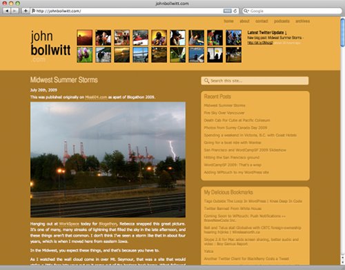
I’ve reworked the design to my website to challenge my limits in terms of web design. It’s taken me about a month or so to get the overall concept down, but it was time to do something different in order to push my boundaries with what I know and am comfortable with. The various sixty4media projects that we’ve been working on has made me think about this a lot, and a recent project for my day job saw me take the website for one of the radio stations I work for, The Beat 94.5, to a temporary overhaul into a complete WordPress site.
The basic inspiration for this design was a hot afternoon while drinking a Vitamin Water, something that I’ve become a fan of over the past year. Looking at their label, I found myself admiring the simplicity of the design to market their product. When it comes down to it, it’s just text and colors. No fancy graphic logo or mascots. Text was the only thing selling their product, so I found some inspiration in that.
For the most part, this effort was one of design over function. I’ve asked for opinions of some folks that I really respect and taken their feedback, which should never be overlooked. I tried to incorporate how other people felt when they saw it but then tried to one up the recommendation in order to push the personal challenge ever more.
If you find problems with the site, be sure to let me know. Any good web designer will tell you that any project, especially something to do with your own site, is constantly in development. You’re truly never satisfied.


