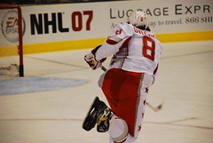
I know that I am not the first one to call “The New NHL” by something so geeky. Look at everything that is going on in the NHL right now, in addition to the revamped rules in this post-lockout era. It’s faster and way more competitive than before. Okay, I think all hockey fans can be in agreement on that one, right?
Then there is the Buffalo Sabres‘ new logo, aka The Buffaslug. I already gave my opinion on it when it was unveiled, and it still doesn’t sit well with me. When I think about it in relation to everything else going on in the world of Web 2.0[wiki], there is this nagging comparison that I’ve been wanting to make. However, one team making a change isn’t enough, but check out this post that examines Web 2.0 logos in general.
Enter the new uniforms that will take over the league next season[rbkedgeuniform.com]. Lighter, water resistant, aerodynamic, and Sidney Crosby approved. That last point can really be ignored, but I know for a fact that there are going to be loads of people who will be saddened, if not pissed, by this change.
These are not what you can consider sweaters anymore. They are jerseys, and all this new technology that goes into them makes them uber expensive. Of course, they’re still brand spanking new, but $300 for a jersey? No thanks.
Tighter fit also means less real estate to paste a logo on the front of your jersey. So if you resize and lose detail, might this be a good time to rethink your logo altogether? That might be pushing it, but what better reason to make a change when everything else a player puts on is changing anyway? Remember, this isn’t just about the jersey as much as it is about pants and socks, too(better hip protection and no more tape). Could next season be the year the “stick in rink”[hockeydb] comes back to replace the Orca Bay logo[hockeydb] for the Canucks? I wouldn’t be surprised, and the change is something I would fully support as long as it looks good with those new threads.
One thing that sticks out to me is the similarity to baseball jerseys around the hips. The way that the front and back dip down will ultimately change the way long time fans think about the traditional sweater. To me, those curves would make it hard to do that horizontal line at the bottom of the jersey. Perhaps when we see them next season, it will be a straight cut across. However, I kind of doubt it. The league is sounding pretty harsh on the topic, and there is threat of fining players next season if they make individual adjustments. I’ve also heard that the third jersey might go away completely and teams will have to wear white when playing in their home rink.
This is why I’m starting to call this the NHL 2.0. New rules, new wardrobe, and a lot of new faces are changing the way the game is played. Just look at the All-Star Game and how many people are going for their first time, not to mention how young a lot of them are.
However, to any team that is going to start changing logos, I pray that they avoid the mindset that has given rise to the Buffaslug. If there is any comparison to the world of Web 2.0 going on here, this is one design concept that I do not want to see when it comes to forging new logos. This is where I have to plead for staying as traditional as possible, however strange that might sound or actually end up being.
I’m okay with change. I am not okay with something that makes me think of Hello Kitty.


OK…so, I am really disconnected from the net because of my home connection…and I am just popping in here during a busy work day (ssshhhh), but I have to chime in again.
I left a comment at Kukla’s about the initial look-see of these babies…and I still hold my opinion to be true. The shift from horizontal flow of the sweater to a more vertical flow is, well, feminine. Example…go online and look at the ‘womens’ jerseys (only sold in pink) on NHL.com. They have the same flowing lines…vertical.
I don’t have a problem with the tighter fit…that actually looks pretty good. If you watch some vintage games in the 50’s and 60’s, the sweaters were actually quite short and much tighter than todays. That look is OK.
These jersey’s slightly remind me of the Chicago White Sox jerseys’ from the late 70’s…the way the bottom of the jersey flows out the back (the only reason you do that on a shirt, is to tuck it in so it stays tucked in!).
Anyway, back to the original point…the sweaters are feminine. I think, though coloring, each team could do a better job of getting their colors and logo’s into that sweater, without having to use the vertical lines that are stitched into it.
Damn…I gotta say one more thing about this (can you tell I really have an opinion about this one?)…
No sports equipment company would go through this, without consulting players during the development process. Now, since the uni’s are developed by RBK, my guess is they used Crosby and others under contract to solicit feedback on the look and fit of the sweater. In any venture, you make the product for the consumer…the ultimate end consumer in this case is the athlete. If RBK and the NHL by-passed that (like the NBA did with the new ball), then they deserve the criticism players and the NHLPA should level at the league and RBK. And if that were the case…RBK and the NHL would stand to lose big (probably RBK, more).
OK…whew.
Ahhh…one more thing. For those that say this isn’t about fashion and is about function, that’s a load of crap. It’s ALL about fashion. It is ALL about how the players look on TV and on the ice. This uni package is definitely designed to make the player look sleeker, something the NHL feels is necessary to attract the average fan (funny, but the casual fans I talk to tell me the same thing, ‘I can’t see the puck on TV’, not, the uni’s are too bulky). Add to that, the desire to try and market a new apparel technology that RBK has developed…and you have a fashion statement with functional characteristics (see, iPod, Air Max 360, Scion), and that comes with a price tag. Which, slaps in the face of the fans, once again.
It’s all a Catch-22 for the NHL. I don’t think they handled the pre-show criticism well. They never prepared their fans for dramatic change in the look of the player…only how the players and game would be played. It just seems as though the NHL marketing department is playing catch-up all the time…instead of innovating and getting new and catchy things out there.
Am I done?? Maybe.
Without a doubt, this is a marketing strategy. Even if that isn’t the direct purpose, it’s a HUGE benefit. The players get better things to play with, and the league gets money in the bank from fans updating their memorabilia.
As to it looking feminine, I can agree on that, but it’s not the first thing that sticks out to me. Watching the superskills last night, I had to wonder as to how much faster a player can skate in a competition like that when wearing the new threads(they wore their respective team, old school jerseys). I’ve gotta see this new stuff in non-all-star designs that are awfully designed. I know they’re all-stars, but do you have to accentuate that?
The other thing is goalies. That extra fabric can help stop pucks, especially in the arm pits. There’s just enough extra jersey in some spots to slow a puck sometimes. How will that change, if at all?