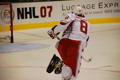
I know that I am not the first one to call “The New NHL” by something so geeky. Look at everything that is going on in the NHL right now, in addition to the revamped rules in this post-lockout era. It’s faster and way more competitive than before. Okay, I think all hockey fans can be in agreement on that one, right?
Then there is the Buffalo Sabres‘ new logo, aka The Buffaslug. I already gave my opinion on it when it was unveiled, and it still doesn’t sit well with me. When I think about it in relation to everything else going on in the world of Web 2.0[wiki], there is this nagging comparison that I’ve been wanting to make. However, one team making a change isn’t enough, but check out this post that examines Web 2.0 logos in general.
Enter the new uniforms that will take over the league next season[rbkedgeuniform.com]. Lighter, water resistant, aerodynamic, and Sidney Crosby approved. That last point can really be ignored, but I know for a fact that there are going to be loads of people who will be saddened, if not pissed, by this change.
These are not what you can consider sweaters anymore. They are jerseys, and all this new technology that goes into them makes them uber expensive. Of course, they’re still brand spanking new, but $300 for a jersey? No thanks.
Tighter fit also means less real estate to paste a logo on the front of your jersey. So if you resize and lose detail, might this be a good time to rethink your logo altogether? That might be pushing it, but what better reason to make a change when everything else a player puts on is changing anyway? Remember, this isn’t just about the jersey as much as it is about pants and socks, too(better hip protection and no more tape). Could next season be the year the “stick in rink”[hockeydb] comes back to replace the Orca Bay logo[hockeydb] for the Canucks? I wouldn’t be surprised, and the change is something I would fully support as long as it looks good with those new threads.
One thing that sticks out to me is the similarity to baseball jerseys around the hips. The way that the front and back dip down will ultimately change the way long time fans think about the traditional sweater. To me, those curves would make it hard to do that horizontal line at the bottom of the jersey. Perhaps when we see them next season, it will be a straight cut across. However, I kind of doubt it. The league is sounding pretty harsh on the topic, and there is threat of fining players next season if they make individual adjustments. I’ve also heard that the third jersey might go away completely and teams will have to wear white when playing in their home rink.
This is why I’m starting to call this the NHL 2.0. New rules, new wardrobe, and a lot of new faces are changing the way the game is played. Just look at the All-Star Game and how many people are going for their first time, not to mention how young a lot of them are.
However, to any team that is going to start changing logos, I pray that they avoid the mindset that has given rise to the Buffaslug. If there is any comparison to the world of Web 2.0 going on here, this is one design concept that I do not want to see when it comes to forging new logos. This is where I have to plead for staying as traditional as possible, however strange that might sound or actually end up being.
I’m okay with change. I am not okay with something that makes me think of Hello Kitty.
