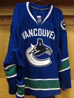
I had to work in Pitt Meadows this morning for the day job, but that wasn’t going to stop me from seeing what I could of the new Canucks jerseys. However, I still missed it by a few minutes. As much as that sucked, you kinda expect these things when it comes to driving anywhere around the lower mainland.
So let’s cover what the jersey is supposed to encompass. There is the “Vancouver” across the top that pays homage to the Vancouver Millionaires[wiki] from ions ago, the first professional hockey team here and the last team to win the Stanley Cup. The orca logo is pretty much what we’ve had for the last ten years, but with a minor tweak in terms of colors. The stick-in-rink (my preferred, overall logo concept) gets to be a patch on the shoulder, much like the last set of jerseys with the whale. And of course, the colors are a throw back to the original jerseys from when the Canucks joined the NHL in 1970[wiki].
That being said, I’m not in awe of what I see. I like it, but I’m not in love with it. It’s pretty cool in some respects, but Rebecca said it well when she mentioned it being a fairly busy design.
Now, it could be much, much worse. I’ve spent most of the morning hearing people complain about the amount of jerseys and logos the Canucks have. It might be true that in the history of the team, it’s changed a fair number of times. But did the organization go Buffaslug on us? No, and that makes me thankful. It’s nothing extremely new, but there is certainly nothing here that makes me say “holy crap!” like I did about Buffalo, or even Nashville for that matter.
I can handle it, and the colors make me love the jersey more than the logo. Let’s face it, the last jersey was very red, white, and blue. These colors not only fall back on the original scheme of the team, but they give stronger roots to B.C., at least to me. The previous jerseys had a more American look to them, and what have they ever done for the good of the game?


totally agree but hate being SO low on your link list. 😛