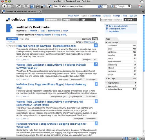
Delicious recently did an overhaul of their site design about three weeks ago, and many folks have already weighed in on what they thought about it.
For me, I have to use something for a while before I really give my full sense of how a redesign like this actually affects my work flow because I use their service so much.
For me, it’s way too hard for me to grasp the concept of writing it as “Delicious”. For so long, it’s been “Del.icio.us.com”, and I think that’s a large, geeky reason that I liked the site. In this redesign, they also did a rebranding and dropped the extra dots. It’s a small thing, and I’m getting over it. I always loved the clever use of the .us domain.
Otherwise, I love the new Delicious. The redesign has long been needed, and it finally matches up with how much I like the service.
For me, I read a variety of RSS feeds. Using Google Reader and Firefox, I can use their browser plugin to quickly bookmark items to either share with others or come back to later. This method might not work for everyone, but it works very well for me. Bouncing between computers at home or work, I can tag something that I find interesting.
Mostly it’s the design that has taken a little time to get used to before I could really decide what I thought. Visually, it works better than it previously did. Sure, it looks prettier, but you can make anything look good and not have function. Delicious seemed to step up to this notion of the K.I.S.S. principle that I’m a big fan of.
If you would like to see the things I tag, feel free to check out my Delicious page.


I’ve really enjoyed using the javascript bookmark I have on my Safari bookmarks bar, whereby it’s one-click and I’m sending a bookmark to you. The new design is clean and works well.