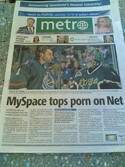
 It isn’t too often that I pick up a copy of the Metro, and it’s usually while I’m waiting for some take out. Snapped a shot of this the other day as game 7 of the Dallas series was approaching.
At first glance, you tend to wonder what hockey has to do with MySpace. And then porn? Oh, wait… it’s two, completely unrelated things. I get it. I think… wait… Yeah, ok. I see what they’re saying.
Give the Metro credit. It catches your eye to see Luongo on the front page with such a big game on the line. Toss the word “porn” and you’ll have more people stopping. Posting this on flickr, I’m glad to see that I’m not the only one. Richard Eriksson left the following comment.
sillygwailo says:
The layout of Metro is always confusing to me. The photos almost never have anything to do with the headline, so the reader–well, speaking for myself–gets the impression that the two are related. At least that’s what I’m used to with other newspapers: a prominent photo has something to do with a headline somewhere on the front page, either next to the photo or underneath it. The Metro goes against this convention. [flickr]
So maybe that cover story was about hockey porn on MySpace?

Classic tabloid layout. The picture is ‘above the fold’ and the article is below. If you fold the paper in half, they can sell it by the photo on the cover…then you turn to see the article and you see PORN…nice work.
Personally…I wouldn’t pick up a rag that had a headline like that…because they try and sell the ‘porn’ line, rather than proper news and information.
Stick with the internet…you can pick and choose.
Stick with the internet for porn or hockey? Geez. All this tabloid media has got me so confused! :p